Edit a visual abstract without generating a new image
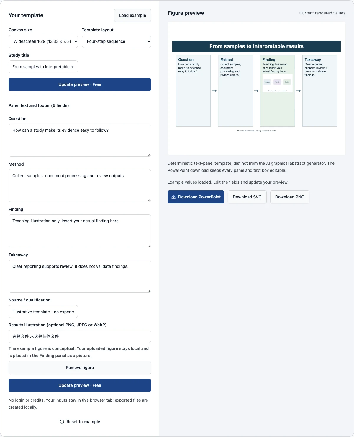
These editable graphical abstract templates give you a fixed, inspectable structure for a short research story. Choose a canvas size and one of five layouts, then replace the text. Unlike the AI graphical abstract generator, this page draws deterministic panels from your own words. It does not reinterpret the study, invent icons or infer results. The displayed wording is the wording you enter, subject to visible wrapping and panel-fit checks. A conceptual workflow illustration is included; replace it with your own image or remove it.
The download you will usually want is the PowerPoint file. It is a single slide at the selected size in which every title, panel and text box is a native object you can restyle, move or delete; only the optional figure is a picture. SVG and PNG are also available. Export stays disabled while the current fields have not been rendered successfully, helping you avoid an old image that no longer matches your draft. The editor works locally and is free; it does not submit an AI task or spend account credits.
Examples you can inspect
Compare the supplied input, saved result and review points before preparing your own figure.
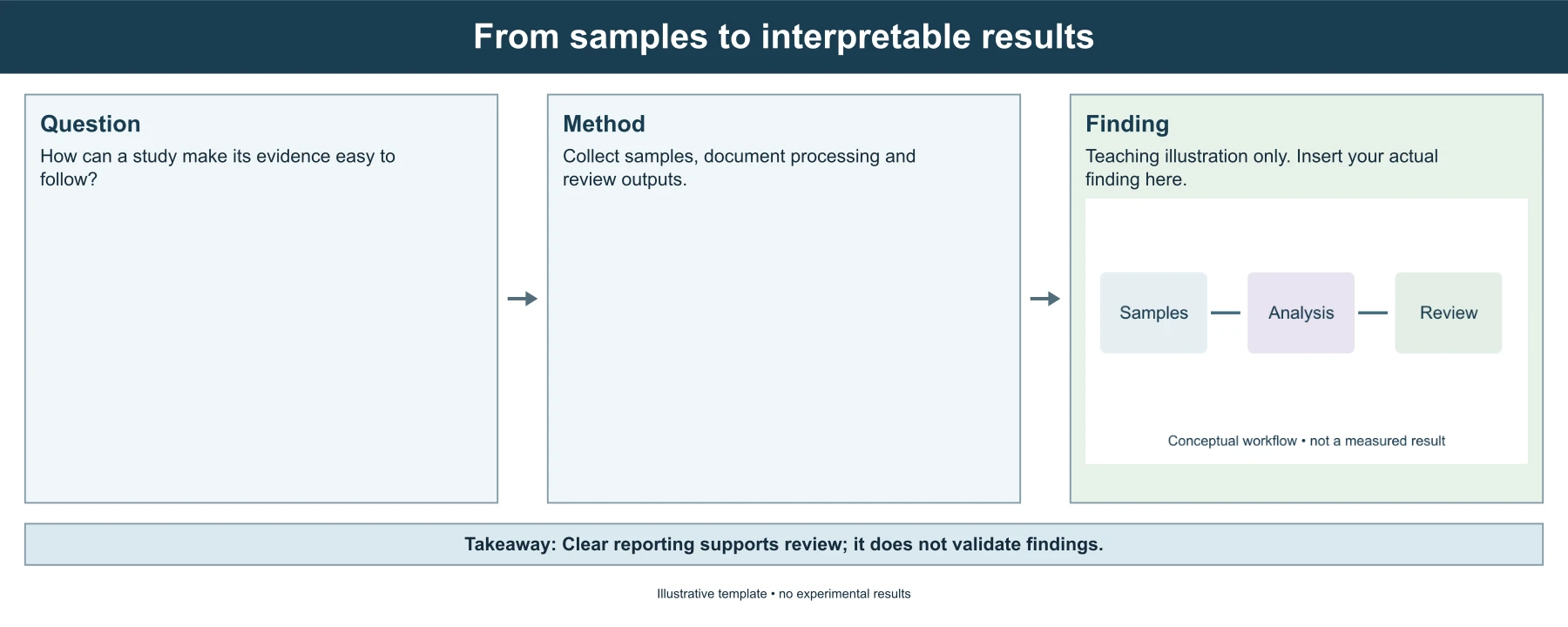
Example: a four-step sequence on a widescreen canvas
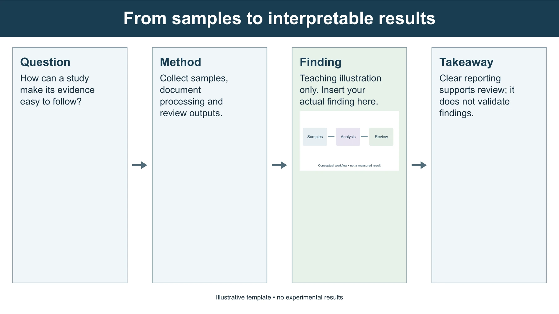
The first example reads from left to right on a 13.33 × 7.5 inch widescreen canvas: a research question, a short method, a clearly labeled teaching finding and a qualified takeaway, joined by arrows. Its title describes a path from samples to interpretable results. The example contains no experimental measurements. The finding panel explicitly asks the author to insert the actual result, so the export cannot be honestly presented as evidence from a completed study without replacement.
Use this sequence when a reader should follow the study's progression. Each panel has one role, which helps prevent a common visual-abstract problem: repeating the same conclusion in the title, results and takeaway while leaving the method unclear. Replace the instructional text with supported facts. Then compare the visual sequence with your manuscript abstract. If the figure skips an important condition or makes a broader claim than the paper, revise the words before concentrating on styling.
Example: a three-part story in the wide 5:2 format
The second example uses the wide canvas, 13.28 × 5.31 inches, a five-to-two strip of the kind some publishers request for graphical abstracts. Question, method and finding sit side by side, and the takeaway runs along the bottom as a single banner. The same teaching text is used, so you can see how a shorter canvas changes line breaks without changing content.
Try this version when the destination specifies a wide, short image. Confirm the exact pixel dimensions and file type with the journal: the canvas matches a ratio, not any publisher's approval. After switching size or layout, update the preview and inspect every panel for fit. The editor reports overly long content rather than clipping a sentence and leaving the figure with an incomplete claim.
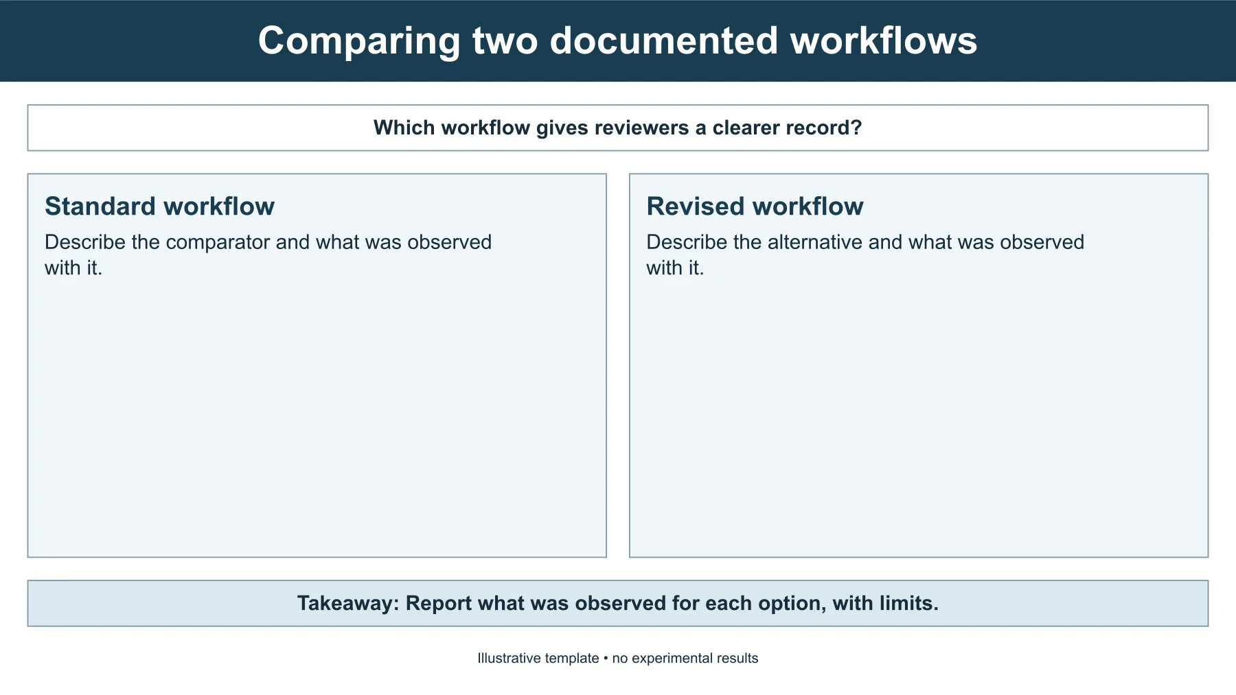
Example: an A/B comparison
The third example compares two documented workflows. A question runs across the top, two named options sit side by side with their own text, and the takeaway closes the figure. The option names are editable, so the panels can be two treatments, two methods or two conditions. The example contains prompts instead of results: it asks what was observed with each option and supplies no numbers, direction of effect or winner.
For your own comparison, give both options the same kind of information so that the layout does not favor one of them. State what was measured and in whom. A side-by-side layout invites a causal reading, so keep the wording at the level of certainty your design supports. This layout has no figure slot; use one of the other four layouts when an image is needed.
Pick the layout that matches the claim
Five layouts are available. The four-step sequence and the two-by-two grid show question, method, finding and takeaway as equal panels. The three-part story gives the takeaway its own banner. Method to finding uses two large panels for studies in which the procedure and the result carry the message, with the question above and the takeaway below. The A/B comparison places two options side by side. Three canvas sizes are offered: widescreen 16:9, a wide 5:2 strip and a square.
A graphical abstract template is useful when the study can be expressed as a small number of clear stages or messages and you want exact control over wording. It is less suitable for complex spatial anatomy, dense molecular pathways or a network of conditional relationships. In those cases, a fixed four-panel summary may explain the study's narrative while failing to show the actual mechanism. Choose the representation that answers the reader's question rather than forcing every project into the same boxes.
The AI generator linked below serves a different task: it creates a raster visual draft from research text and requires scientific review. This editor offers predictable text and editable vector geometry. Neither page guarantees journal acceptance or scientific correctness. If you need a specific biological illustration, use the biology tool or an appropriate external drawing workflow, then verify the output. Selecting a template should reduce presentation work without weakening the evidence it communicates.
Write a short, factual question panel
The first panel should establish the research question or the relevant setting. Name the problem directly and include the scope needed to interpret the rest of the figure. Avoid a broad introductory statement that could apply to many unrelated papers. A concise question makes the later method and finding easier to connect. If you use an abbreviation, define it in the caption or accompanying text rather than assuming every reader shares the same vocabulary.
The editor limits each panel to a short amount of text. This encourages focus, but a character limit is not a scientific editing rule. Do not remove a crucial population, condition or qualification simply to fit. Rephrase the sentence, use the wider layout or choose another workflow when the necessary context cannot remain legible. The title can introduce the topic, while the question panel supplies the specific issue the study examined.
Describe the actual method
The method panel should identify what was done and what the reader needs to understand the result. A study design, sample type, intervention or analysis sequence may matter more than a list of every instrument. Choose those elements from the documented methods. The template does not parse a paper or infer missing procedures. Generic teaching text such as collect samples is not a substitute for the real design once the figure represents an actual study.
Keep method and conclusion language distinct. A panel explaining how a measurement was obtained should not also assert that a treatment worked unless that assertion belongs to a supported result. If the study has several arms or conditions, make their relationship understandable within the available space. When the detail is too complex for one short panel, use the abstract as an overview and direct readers to the full figure or manuscript for the complete design.
Preserve the meaning of the finding
Use the finding panel for the central supported observation. Include units and the relevant comparison when a number appears. Avoid invented percentages, unspecified improvements or words such as significant without the underlying statistical context. The editor reproduces the text you enter, so a clean export can still contain an unsupported claim. Visual polish does not validate the statement or show that a result has been independently checked.
Shortening results can accidentally remove the conditions under which they were observed. Read the panel beside the original result and ask whether they make the same claim. Distinguish a measured outcome from a hypothesized mechanism. If the work is a protocol or proposal, state that no result is available instead of adding a fictional one. The teaching examples are deliberately labeled, and that distinction should remain visible until you replace them with your own supported material.
Use the takeaway to explain scope
The takeaway should connect the finding to its reasonable implication without expanding beyond the evidence. It can name a practical interpretation, a limitation or a next question. Do not repeat a stronger headline merely because it sounds memorable. A reader may see the graphical abstract independently of the paper, so essential qualifications need to survive in the figure or its caption. The footer can hold a short source or qualification, but it is not an unlimited reference list.
Understand the three downloads
PowerPoint keeps the panels, arrows and text as native shapes and text boxes on a slide of the selected size. Open it in presentation software to change typography, add icons or rearrange the panels, then export the format your journal requests. Applications can render fonts and line breaks slightly differently, so check the slide after opening it. SVG holds the same drawing as vector elements for vector editors.
PNG is rendered from the SVG at 96 pixels per inch of the canvas, so the wide canvas is about 1275 pixels across. It is convenient for drafts but flattens text and shapes, and enlarging it adds no detail. When a journal specifies minimum pixel dimensions, export from the PowerPoint or SVG file at that size instead of scaling the PNG. The page does not write resolution metadata, and the journal's requirements should guide the final preparation.
Review the complete abstract as a standalone figure
Inspect the output at the size a reader will actually see. The four panels should form a coherent explanation without relying on your draft notes. Check spelling, units, abbreviations and any source information in the footer. Confirm that the final export contains no teaching placeholders. Compare both layout options when a line break changes the emphasis or makes a qualification easy to overlook.
Ask a collaborator to explain the research claim back to you using only the image and caption. If their interpretation is broader than the study supports, revise the figure. Keep an independent copy of the entered text and the PowerPoint file; browser-tab restoration is helpful but is not permanent document storage. A useful graphical abstract makes the evidence easier to understand while preserving the boundaries of what was actually studied.
Questions about editable visual abstracts
Does the template generate illustrations automatically?
No. It draws your text into editable panels. The AI generator is a separate paid workflow for raster visual drafts.
Can I move panels freely?
Not in the browser editor, which offers five fixed layouts. Download the PowerPoint file and every panel, arrow and text box can be moved or resized there.
Can I edit after downloading?
Yes. The PowerPoint and SVG files keep separate elements; the PNG does not. Recheck wording and layout after further edits.
Is the result accepted by every journal?
No. Confirm the destination's current instructions for dimensions, formats and content. A downloadable template is a starting point, not publisher approval or a scientific validation of the text.