Start from the size your event requires
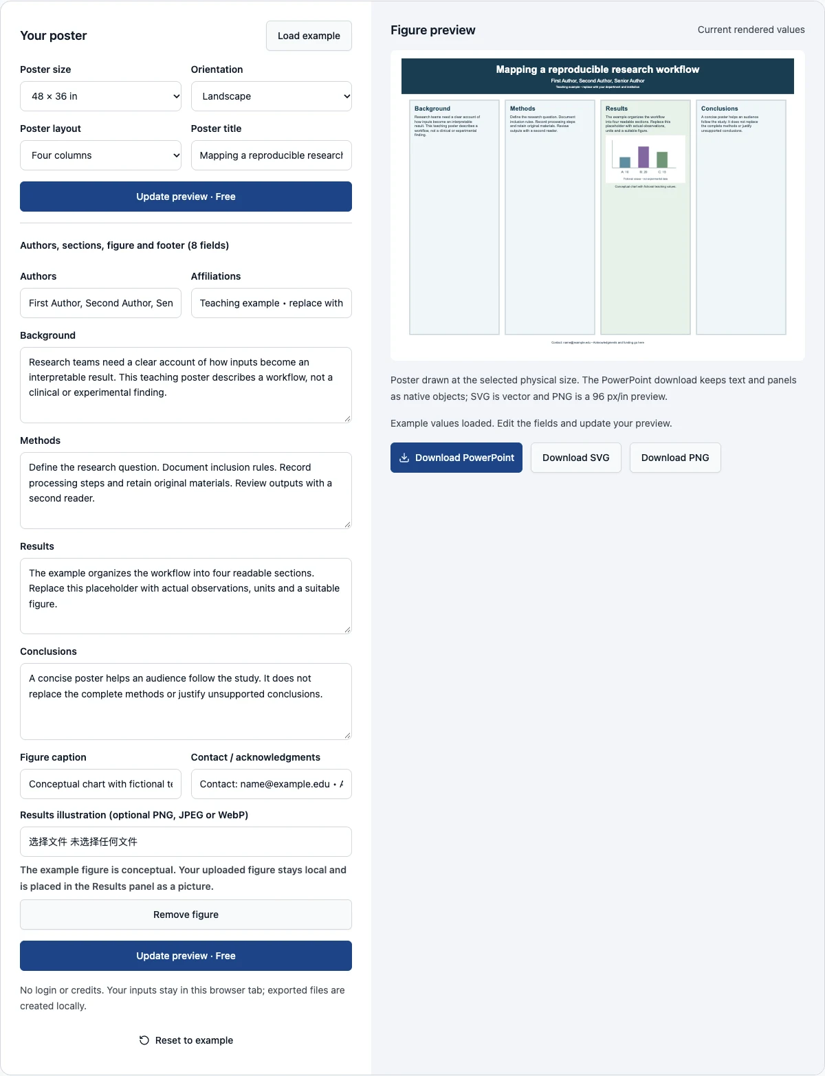
These academic research poster templates start with the physical page. Choose 48 × 36 inches, 36 × 24 inches, A0 or A1, set landscape or portrait, then pick four columns or a two-by-two layout. Replace the title, authors, affiliations, four sections, figure and contact line. The preview is drawn at that exact size, and the same layout downloads as a native PowerPoint file whose slide has the chosen dimensions. You are not buying a catalog image to discover later whether it can be edited.
The PowerPoint file keeps the title, every section and the footer as ordinary text boxes and the panels as shapes; only the figure is a picture. Open it in PowerPoint, Keynote or another application that reads .pptx files to change fonts, move panels, add logos and export the PDF your printer asks for. SVG and PNG downloads remain available. Editing and all three exports run in your browser and are free; none requires an account or image-generation credits. Text that does not fit a panel at the chosen size is reported, not clipped.
Examples you can inspect
Compare the supplied input, saved result and review points before preparing your own figure.
Example: a 48 × 36 inch four-column poster
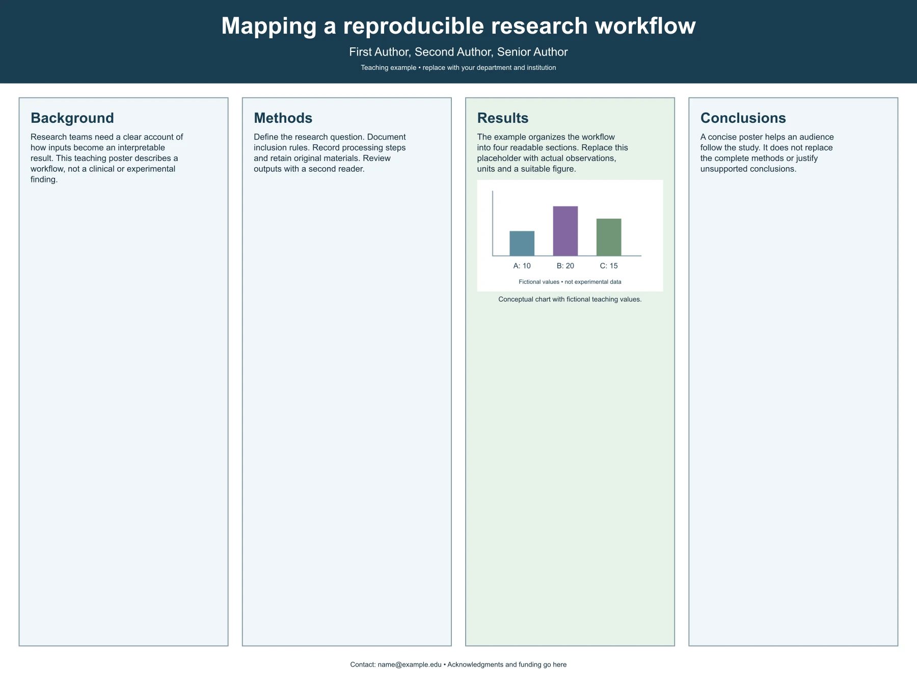
The first example is a landscape 48 × 36 inch poster with Background, Methods, Results and Conclusions from left to right. Its subject is a fictional reproducible research workflow, so it makes no claim about clinical outcomes or measured performance. The author and affiliation lines are visible placeholders rather than an invented institution. The small bar chart uses fictional values of ten, twenty and fifteen, labeled as teaching data, with a caption beneath it.
Use this format when the argument has a clear progression that readers can follow without jumping between distant panels. Keep each section focused on its role. At this size the title is set at 88 points and the body text at 32 points; those values scale with the poster so that smaller sizes stay in proportion. Inspect the poster at a reduced display size: the structure should remain evident before a viewer reads every sentence. Replace all teaching text before presenting your actual work.
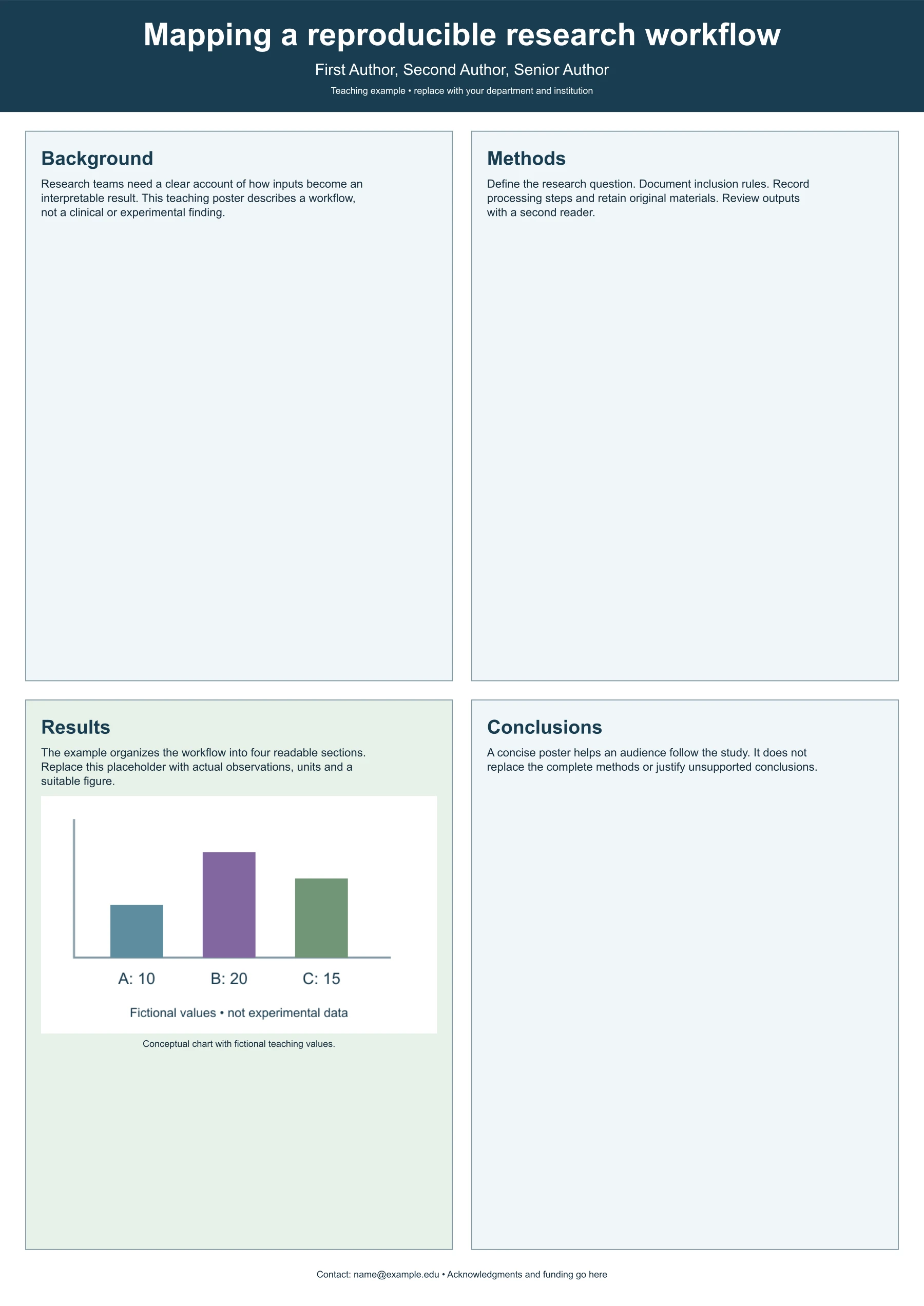
Example: an A0 portrait poster in a two-by-two layout
The second example places the same teaching content on a portrait A0 page, 841 × 1189 millimeters, in a two-by-two arrangement. Changing size and orientation changes the reading path and the type sizes but not the argument. The background and methods sit above the results and conclusions, and the wider panels suit longer sentences. A0 is slightly narrower than a 36-inch page, so the type is scaled down in proportion.
Compare versions before committing to a format. Extra available space is not a reason to expand every paragraph. Readers need enough detail to understand the study and decide what to ask, rather than a miniature paper. The editor rejects text that exceeds a panel at the selected size instead of silently clipping the export. Shorten the wording, choose a larger size or switch layouts when the full explanation cannot remain readable.
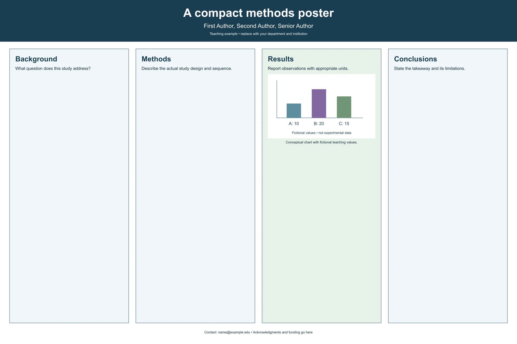
Example: a compact 36 × 24 inch methods poster
The third example uses the smaller 36 × 24 inch page, the title A compact methods poster and short instructional panels. It demonstrates how a poster can focus on question, design, observations and limitations without filling the surface with decorative text. The default statements are prompts for content, not evidence from a completed study.
Use it to draft your own methods-centered narrative. State the actual research question, name the real design and sequence, report supported observations with appropriate units and qualify the takeaway. If the study is ongoing, say which results are preliminary or absent. An attractive poster should not suggest a finished experiment simply because a Results heading is present. The template gives you a structure; your source material determines which claims belong in it.
Choose the story before the layout
Write one sentence explaining what you want a viewer to remember. Then identify the evidence that supports it and the minimum method detail needed to interpret that evidence. This exercise often reveals that a poster should emphasize a narrower question than the full paper. A short, descriptive title works better than an unexplained acronym or an unsupported promise. The editor limits the title to one hundred characters and two lines so that it stays legible in the header.
Decide whether your audience will approach from left to right or scan a grid for a particular result. Use the columns option when sequence matters and the grid option when related parts benefit from more width. Portrait pages make four columns narrow, so the grid usually reads better there. The choice is reversible, but switching does not rewrite your content. Recheck line breaks and panel fit after changing size, orientation or layout.
Write concise panel content
Each section accepts up to twelve hundred characters, and the editor reports an error if the wrapped lines would exceed the panel at the selected size. The character limit is an upper bound, not a promise that every text fits every size. Avoid dense prose, unexplained abbreviations and a methods section copied wholesale from a manuscript. Use a short account of the design and its important conditions, keeping complete details available in the paper or other supporting material.
Report results as observations, with units and the relevant population or experimental condition. Distinguish a measurement from an interpretation. The conclusion should explain what the evidence supports and what remains unresolved. If you have no results yet, label the poster as a proposal or work in progress rather than using fictional numbers to fill a panel. The example's results paragraph is deliberately a teaching statement, so it must be replaced for a real research presentation.
Plan figures and tables with care
The template has one figure slot in the Results panel, with an optional caption. PNG, JPEG and WebP inputs are decoded locally, limited to four megapixels and placed as a picture; they are not converted into editable vector objects. This is not a complete page-layout application with drag-and-drop panels, automatic references or plotting. If your research depends on several complex figures, download the PowerPoint file and add them there, where every panel can be resized. Do not shrink essential graphs until their axis labels disappear merely to preserve placeholder text.
A poster figure should help a viewer answer a specific question. For a quantitative result, show relevant scales, units and uncertainty where appropriate. For a mechanism or workflow, distinguish observations from conceptual explanation. Keep original figure files and confirm that you have permission to reuse any material. A diagram that looks polished is not necessarily scientifically correct. Check labels, arrow meanings and numbers against the source, and ask a knowledgeable collaborator to review the assembled poster.
Print from the editable file, not from the preview
The PowerPoint slide is set to the size you selected, so a PDF exported from it carries the same page dimensions. That is the file to prepare for printing: check the fonts, replace the small teaching figure with your own and export the PDF with the settings your print service requests. The SVG is also sized in physical units and scales without loss. The PNG is rendered at 96 pixels per inch of the selected size and is intended as a preview or screen copy; enlarging it does not create new detail.
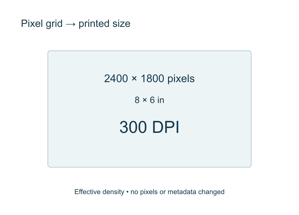
Confirm the event's required dimensions and orientation before you start, since changing them later changes how text wraps. This page does not add bleed, crop marks or a color profile, and it cannot certify a file for a particular printer. An uploaded figure is limited to four megapixels, which is small on a large poster; place the full-resolution figure in the PowerPoint file. The DPI calculator can help you check a raster figure at its intended printed size. These limits are stated so that a successful download is not mistaken for a completed print-production check.
Make authorship and sources explicit
Replace the teaching author, affiliation and contact lines with real information that you are authorized to share. Use the title and author line consistently with the submitted abstract or event program. An institutional logo or branded poster standard may require separate permission and formatting. These templates are independently created and do not impersonate university designs. They should not be described as an official institutional template simply because you add an affiliation name.
Place necessary source acknowledgments in the figure caption, the footer or the edited PowerPoint file. The simple footer has limited space, so it cannot hold an unlimited reference list. Preserve citations and underlying data in the accompanying research material. If the poster summarizes published work, distinguish your own contribution from prior findings. Clear source attribution helps viewers assess the argument and avoids allowing the template's visual authority to stand in for provenance.
Review from the audience's position
After editing, inspect the poster without reading your draft notes. The title should identify the topic, the question should be evident and the result should be understandable within a short scan. Look for inconsistent terminology across panels. Check the exported image in grayscale and at the scale a viewer or reviewer will see. A readable layout is more useful than one that retains every sentence at a tiny size.
Ask a colleague to explain the study back to you using only the poster. Their uncertainties often reveal missing definitions or an overconfident conclusion. Review spelling, units, contact details and all placeholder content before exporting the final version. Keep the PowerPoint file and an independent copy of your text, since a restored browser-tab draft is a convenience rather than a permanent archive. The poster should invite informed questions while accurately representing what the study actually did.
Questions about academic poster templates
Can I download PowerPoint or PDF?
PowerPoint, yes: the download is a native .pptx file at the selected size with editable text boxes and shapes. The page does not create a PDF itself; export one from the PowerPoint file with your printer's settings.
Which sizes are available?
48 × 36 inches, 36 × 24 inches, A0 and A1, each in landscape or portrait. For another size, download the nearest one, change the slide size in your presentation software and recheck the layout.
Is this an institutional template?
No. The examples are original teaching layouts without university branding or a claim of institutional approval.
Is the PNG ready for a large conference print?
No. It is a 96 pixel-per-inch preview. Print from a PDF exported from the PowerPoint file, or from the SVG, after checking the requirements of your print service.