Document a two-group participant flow
This CONSORT flow diagram generator creates an independently drawn participant-flow draft for a randomized trial with two parallel groups and one primary analysis population. You enter documented enrollment, allocation, follow-up and analysis counts; the tool checks selected arithmetic relationships and renders the diagram locally. Its four stages, Enrolment, Allocation, Follow-Up and Analysis, and its box wording follow the CONSORT 2025 flow diagram, in which loss to follow-up and analysis are reported for the primary outcome. It does not determine your analysis population, judge trial quality or certify compliance with a reporting guideline. The current official CONSORT resources should guide the final report and any design-specific extensions.
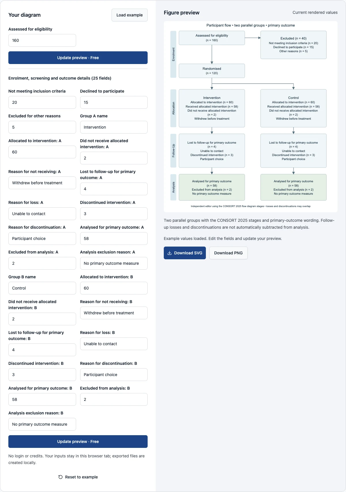
Start with the fictional values and replace the assessed and excluded counts. Open the group and outcome details to edit both arms, including reasons for not receiving the intervention, loss to follow-up, discontinuation and analysis exclusion. Update the preview before exporting. The page preserves the previous valid drawing when an input fails a check, and disables download until the current values render successfully. SVG and PNG exports are free and do not submit participant counts to an AI service.
Examples you can inspect
Compare the supplied input, saved result and review points before preparing your own figure.
Example: a balanced allocation
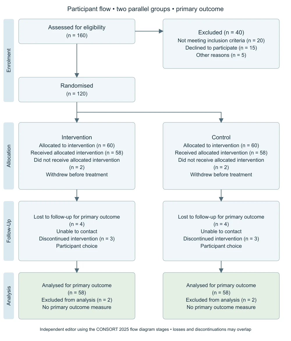
The first example assesses one hundred sixty people for eligibility. Twenty do not meet the inclusion criteria, fifteen decline to participate and five are excluded for other reasons, forty in total. This leaves one hundred twenty randomized participants, allocated equally to intervention and control. In each group, two do not receive the intervention, four are lost to follow-up and three discontinue. Fifty-eight are included in the stated primary analysis and two are excluded from it.
These follow-up numbers are not automatically subtracted from the allocation. The example does not claim that losses, discontinuations and analysis exclusions are the same people. That distinction matters because a participant can discontinue treatment while still providing outcome data, and an analysis can include participants with incomplete follow-up under a declared method. The chart illustrates reporting categories, not a recommendation for handling missing data. Replace every count and reason with evidence from your actual trial records.
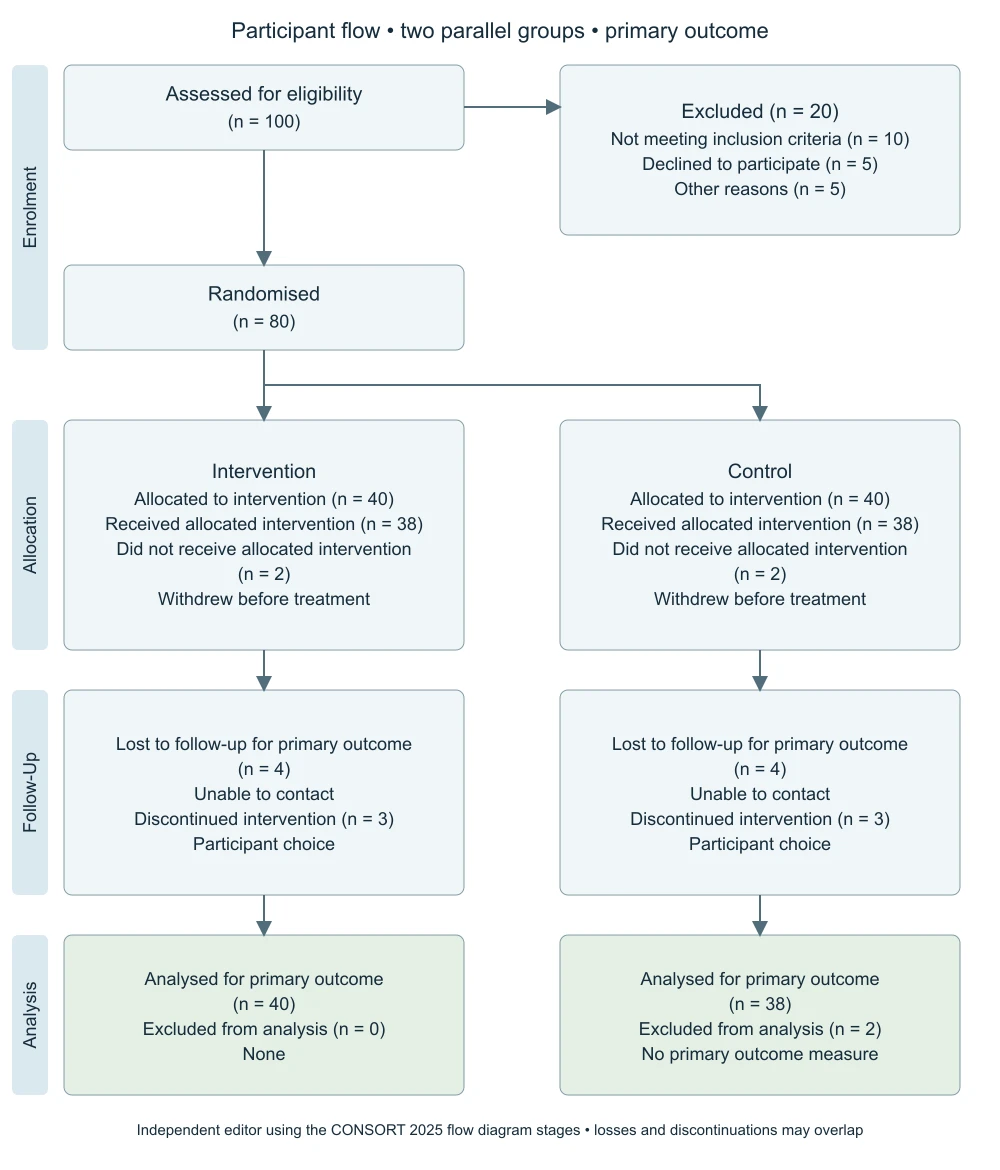
Example: analysis populations differ between arms
The second example has one hundred assessed participants. Ten are ineligible, five decline and five have other pre-randomization exclusions. Eighty participants are randomized and forty allocated to each arm. The first arm includes all forty in the primary analysis, while the second includes thirty-eight and excludes two. The saved drawing makes this asymmetry visible without implying that equal allocation requires equal final analysis counts.
Use this example to review the names of analysis populations. A diagram that says only Analyzed can leave a reader unsure which outcome or population is being counted. This editor labels the stage as the primary outcome analysis, but your caption and methods still need to explain the definition and reasons for exclusions. If your report has several outcome-specific populations, this single-analysis layout may be insufficient. Do not combine unlike analysis denominators simply to fit them into one box.
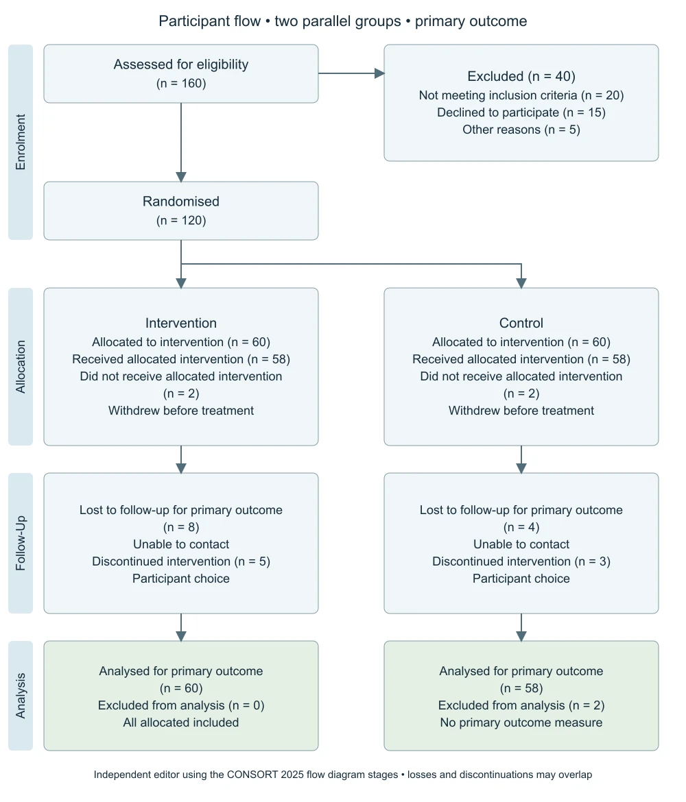
Example: follow-up loss with all allocated analyzed
The third example keeps the original allocation but increases reported follow-up loss and discontinuation in the first arm while including all sixty allocated participants in its stated analysis. The arithmetic can remain consistent because the analysis population is not necessarily the complete-case follow-up population. The figure does not explain how missing outcomes were handled or prove that the analysis is appropriate; those details belong in the statistical methods and results.
This is a deliberate test against a common shortcut: assuming that analyzed must equal allocated minus every follow-up category. Such subtraction can double-count overlapping categories and misrepresent an intention-to-treat analysis. Enter the documented analysis counts instead. Then check that the corresponding excluded-from-analysis count accounts for the remaining allocated participants in this layout. If your design or analysis definition does not fit that accounting, choose a more suitable template rather than changing valid trial data.
Prepare enrollment and exclusion counts
Use a consistent reporting snapshot and a clearly defined unit, ordinarily individual participants for this simple parallel-group template. The assessed count refers to people assessed for eligibility, while the three pre-randomization exclusions describe why some were not randomized. Their total is subtracted from assessed to calculate randomized. The two allocated group counts must add to that randomized total. Negative values, missing counts and fractional participants are rejected.
The fields for ineligibility, declining participation and other exclusions are broad categories, not an arbitrary taxonomy of all possible reasons. Retain detailed reason records outside the tool, and explain an aggregated Other category when needed. The editor cannot detect whether the same person appears in two source logs or whether an exclusion was classified correctly. Reconcile identifiers and decisions before entering totals. The figure should summarize your records, not repair inconsistencies through convenient rounding or invented balancing values.
Report intervention receipt separately
For each arm, the editor asks for the number allocated and the number who did not receive the intended intervention. Received intervention is calculated as their difference. A reason field provides a short explanation for nonreceipt. If more than one reason matters, summarize concisely in the box and retain a detailed account in the trial report. Keep the wording specific enough for readers to distinguish withdrawal, operational problems and other circumstances.
Receiving the intervention is not equivalent to completing it or entering a particular analysis. Do not move a discontinuation count into nonreceipt merely because both occur before final outcomes are assessed. Verify the timing and definitions used by the study. The calculator enforces that nonreceipt cannot exceed allocation, but it does not infer intervention exposure from case records. The source data and protocol determine what the count means; the diagram only renders your documented definition.
Keep follow-up and discontinuation distinct
Loss to follow-up and discontinuation of the intervention are separate fields with separate reasons. In the 2025 diagram the loss count refers to the primary outcome: enter participants without primary outcome data because they were lost, not everyone who missed a visit. The two categories may overlap for some participants. The editor checks that neither count individually exceeds the allocated number, but deliberately does not require their sum to stay below allocation or subtract that sum from analysis. This avoids treating potentially overlapping categories as disjoint groups. You should nevertheless investigate unexpected totals in your trial records before using them in a figure.
Use concise reason labels that remain readable after export. A short phrase can identify the main circumstance without describing confidential participant information. If multiple reasons need separate counts, this compact editor may not provide enough detail for your reporting needs. Expand the exported SVG carefully or use a more suitable official template. Do not conceal important follow-up differences just because a single short field is easier to fill.
Define the primary analysis population
Each group has an analysed-for-primary-outcome count, an excluded-from-analysis count and a reason field; the diagram uses the British spelling of the official template. In this editor those two counts must add to the allocated group total. This is a bookkeeping assumption for the supported single-population layout, not a universal statistical rule. It makes the displayed denominator inspectable and forces the author to account for allocated participants within that stated population. The tool does not decide whether exclusions are justified.
Explain the actual analysis approach in the manuscript. Terms such as intention-to-treat, per-protocol or complete case need definitions appropriate to the study, and the diagram alone cannot establish that a method was applied. If a participant contributes to some outcomes but not others, make the relevant denominators clear elsewhere. A flow diagram is a reporting aid, not a replacement for a statistical analysis plan, outcome table or transparent account of missing data.
Match the reporting framework to the design
The official CONSORT resources include a current statement and materials for reporting randomized trials, along with extensions for particular designs and interventions. This page is limited to two parallel arms and a single primary analysis. It does not directly support cluster totals, multiple arms, crossover periods, factorial designs or several analysis populations. An accurate report may need substantially different relationships and labels from this simple template.
Follow the applicable official guidance and your journal's requirements, then assess whether this drawing can represent the necessary information. The source link below helps you inspect the original resources. The page is not endorsed by CONSORT and does not advertise an official certification. Balanced counts are useful evidence of internal arithmetic consistency, but they cannot establish appropriate randomization, allocation concealment, follow-up quality or unbiased analysis.
Export without losing the source of truth
SVG preserves the boxes, arrows, text and counts as vector elements for further editing. PNG renders the same drawing as a raster image at native export dimensions. Neither format includes individual participant records, trial identifiers or a durable history of edits. Retain the underlying count table and reporting snapshot in your study documentation. Local restoration in a browser tab can help with interrupted work, but it is not an audit trail.
Inspect both arms at the final display size before submission. Long explanations may need to move into a caption or accompanying text to keep the diagram readable. After any manual vector edit, check the arrows, denominators and reason labels against the source table again. Have a collaborator follow the participant pathway from enrollment through analysis and identify any unexplained transitions. A clear flow should expose differences, not hide them behind visually symmetric boxes.
Questions about trial flow diagrams
Is this an official CONSORT tool?
No. It is an independent editor with a limited two-group layout. Consult the official current statement and applicable extensions for final reporting.
Should I subtract everyone lost to follow-up from analyzed?
Not automatically. Use the documented primary analysis population and explain the handling of missing outcomes. Follow-up losses, discontinuation and analysis exclusions can represent different or overlapping categories.
Can I add a third arm?
This version supports two arms. Changing a group label does not create another allocation branch; use an appropriate template for a different design.
Why did a balanced-looking chart fail?
The editor checks source counts, not visual balance. Assessed minus pre-randomization exclusions must match both allocations together; analyzed plus analysis exclusions must match each arm's allocated total. Correct the records or choose a layout that matches your actual reporting structure.
Check the applicable reporting guidance
Official SPIRIT–CONSORT resources for researchers. This independent tool does not certify reporting compliance.