A Reference Shelf for the Hardest Figure in the Paper
Ask anyone who has written a machine-learning paper which figure took longest, and the answer is usually the first one. Figure 1 has to explain the whole idea to someone who has read nothing yet, and there has never been a good place to see how other people solved that problem. You remembered three or four figures you liked, and you scrolled through PDFs looking for more.
The Top-Conf Figure Gallery fixes that. It is an open-source, static website that collects 2,298 Figure 1 and teaser figures from ICLR, ICML, NeurIPS, CVPR, ACL and AAAI, 2023 through 2025, each linked back to its paper. The GitHub repository went up on 17 September 2026 and had passed 250 stars four days later, which says something about how many people had the same problem.
This post covers what is in the gallery, what its data reveals about how overview figures are built, and a routine for getting from browsing to a figure of your own.
What Is in It
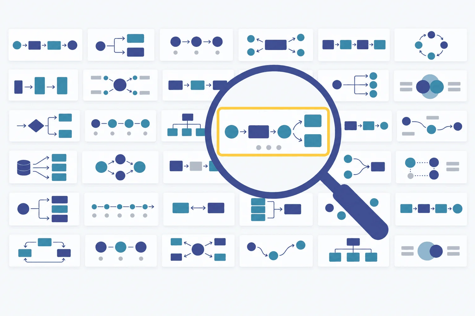
Every entry records the paper title, all authors, venue, year, a link to the paper, the PDF source, and a visual-pattern tag. The interface filters by venue, year and pattern, searches titles and authors, and opens figures in a lightbox you can page through with the arrow keys. There is no backend and no build step; you can clone the repository and open index.html from disk.
| Venue | 2023 | 2024 | 2025 | Total |
|---|---|---|---|---|
| NeurIPS | 206 | 329 | 268 | 803 |
| ICLR | 68 | 88 | 214 | 370 |
| ACL | 84 | 74 | 168 | 326 |
| ICML | 51 | 87 | 172 | 310 |
| AAAI | 59 | 66 | 139 | 264 |
| CVPR | 65 | 64 | 96 | 225 |
The selection is opinionated on purpose. According to the project's methodology notes, candidates are cropped from the published PDFs, passed through more than 25 rejection rules that throw out default matplotlib charts, plain tables, screenshots and unlabelled photo grids, de-duplicated by perceptual hash, selected under venue and year quotas with the patterns stratified, and then reviewed by a human page by page. What is left is figures that someone clearly designed. The maintainer is explicit that this is a reference library, not a ranking of papers, and the uneven counts per venue reflect how common designed overview figures are at each one, not how good the venue is.
What the Data Says
The gallery publishes its full metadata as a JSON file, so we ran the numbers. Three things stood out.
Figure 1 is wide, and the median is almost exactly 21:9
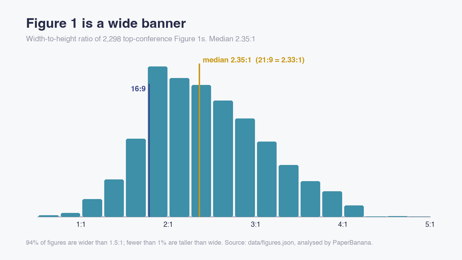
The median width-to-height ratio is 2.35:1. Ninety-four percent of the figures are wider than 1.5:1 and fewer than 1% are taller than wide. The middle half of the distribution runs from about 1.9:1 to 2.9:1. This is the shape of a figure that spans two columns at the top of a page: width is free, height costs you text.
The practical consequence: do not compose Figure 1 on a square or 4:3 canvas. Even 16:9 (1.78:1) is narrower than four out of five figures here. A 21:9 canvas (2.33:1) puts you at the median from the first sketch.
Six patterns, one of them a catch-all
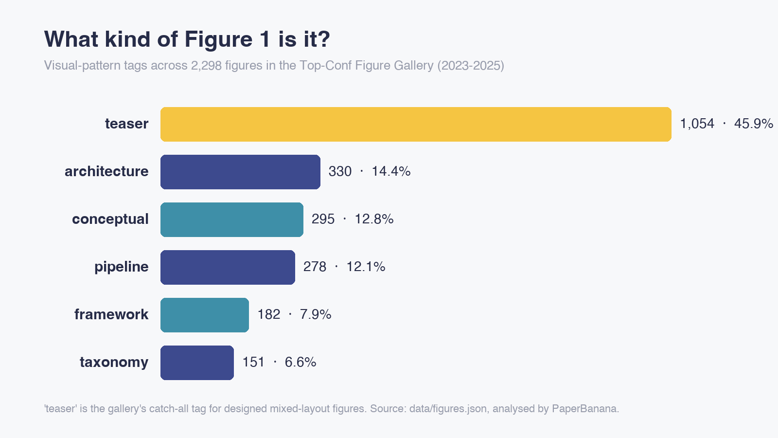
The tags describe what a figure does visually, not the paper's topic. architecture (model internals), conceptual (a visual metaphor for the core idea), pipeline (staged data flow), framework (cooperating modules) and taxonomy (task or benchmark overviews) together cover 54% of the gallery. The other 46% is tagged teaser, which the project uses for designed mixed-layout figures. In practice teaser is where everything that does not fit a single pattern goes, so treat it as "browse me" rather than as a category.
We pulled one real example of each pattern apart in a companion post, 6 Figure 1 layouts top-conference papers keep reusing.
Benchmark overviews are up, and venues have habits
Among the 2023 figures, 2% are tagged taxonomy. Among the 2024 and 2025 figures it is 8%. framework rose from 6% to 9% over the same period, while architecture fell from 18% to 12%. More benchmarks and more agent systems, fewer papers whose headline is a new block diagram.
Venues differ too. At ACL, 11% of the selected figures are taxonomy and only 6% are architecture. At AAAI it is the reverse: 18% architecture, 1% taxonomy. CVPR has the fewest framework figures of any venue, at 4%.
Read these as descriptions of a curated sample, not as measurements of the field. The gallery was filtered for design quality by one maintainer, and its pipeline selects under venue and year quotas with the patterns stratified, so part of any share is a curation decision. The aspect-ratio finding does not depend on the tags; the pattern trends are a hint worth checking against your own reading, nothing stronger.
A Routine for Using It
Browsing a gallery feels productive and often is not. This is the routine we would suggest.
1. Write the one-sentence story before you open the gallery. Input, what happens to it, output. If you cannot write it, no layout will save the figure, and you will end up picking the prettiest example rather than the most relevant one.
2. Filter by pattern, not by topic. Your instinct will be to search for your own subfield. Resist it at first. A retrieval paper and a robotics paper with the same story shape ("three stages, the second is ours") want the same skeleton. Pick the pattern that matches your sentence, then look at ten or so figures from any field.
3. Write down the skeleton, not the style. For each figure you like, note four things: reading direction, number of panels, what sits in the visual centre, and how many colours carry meaning. After ten figures you will see two or three skeletons repeating. Choose one.
4. Then search your own topic. Now use the search box (agent, diffusion, retrieval, benchmark) to see the conventions your reviewers are used to: how your community draws a frozen encoder, a memory, a tool call. Title keywords give a sense of coverage: 196 of the paper titles contain "LLM", 161 "graph", 121 "diffusion", 112 "agent" and 103 "multimodal".
5. Check at paper width. Whatever you draw, shrink it to the width of a two-column page. Any label you cannot read gets bigger, moves, or goes.
What It Is Not
It is not a free image library. The repository's code is MIT-licensed, but the figures remain the property of their authors and publishers, and the project says so clearly and offers a 72-hour takedown route. Licences differ by venue and sometimes by paper. ACL Anthology material from 2016 onwards is CC BY 4.0, which is why our companion post reproduces ACL figures with attribution; for anything else, check the licence on the paper itself before you reuse a figure anywhere.
It is not complete. It covers six venues and three years. EMNLP, CHI, CoRL and RSS are on the roadmap but not in the data yet, and the maintainer invites suggestions through GitHub issues.
It does not have a page per figure. The site is a single page, so you cannot link a co-author to one specific figure; send the paper link from the card instead.
From Skeleton to Figure
The gallery answers "how should this be laid out?". It does not draw anything. Once you have a skeleton, PaperBanana generates publication-ready academic figures from a text description: describe the layout you chose, name your modules and your running example, and set the aspect ratio to 21:9. Our six Figure 1 layout patterns post has six ready-made layout prompts to start from, and when a reviewer asks for one more label you can convert the result into a fully editable SVG.
Sources
- Top-Conf Figure Gallery and its GitHub repository, including
data/figures.json,docs/METHODOLOGY.mdandIMAGES_POLICY.md. Star count as of 21 September 2026. - All statistics in "What the Data Says" were computed by PaperBanana from
data/figures.jsonon 21 September 2026 (2,298 entries). - ACL Anthology: copyright and licensing FAQ.