Figure 1 Is a Layout Problem Before It Is a Drawing Problem
Most researchers open a drawing tool with the content of Figure 1 already clear in their head and no idea how to arrange it. That is the expensive part. The modules, the arrows and the example are known; what is missing is the skeleton: which way the eye travels, what sits in the visual centre, how many panels there are.
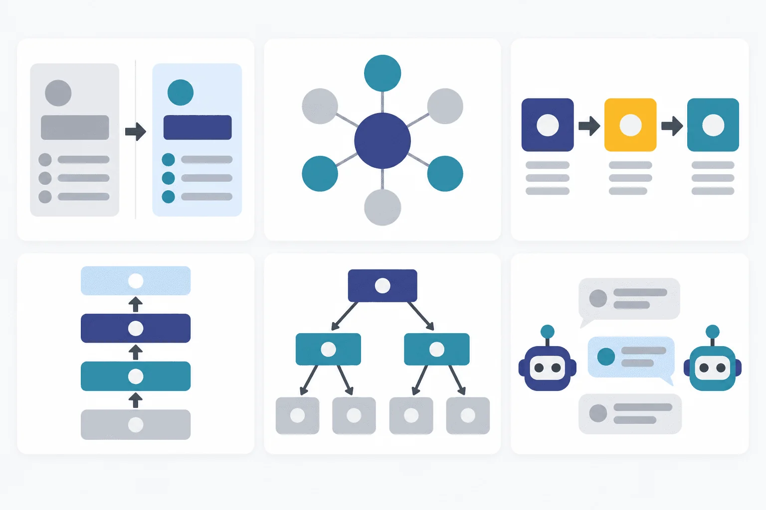
The good news is that the skeletons repeat. We went through the metadata of the Top-Conf Figure Gallery, an open collection of 2,298 hand-reviewed Figure 1 and teaser figures from ICLR, ICML, NeurIPS, CVPR, ACL and AAAI (2023–2025), and the same six layouts keep coming back. This post walks through each one with a real figure from an ACL paper, says what is worth borrowing from it, and gives a layout prompt you can adapt.
What 2,298 Figure 1s Have in Common
Two numbers from the gallery's data file are worth knowing before you draw anything.
Figure 1 is a wide banner. The median width-to-height ratio across all 2,298 figures is 2.35:1. Ninety-four percent are wider than 1.5:1, and fewer than 1% are taller than they are wide. The reason is mechanical: an overview figure usually spans both columns at the top of page one or two, so height is the scarce resource. If you compose on a square canvas and squeeze it later, labels become unreadable. Start wide.
Benchmark overviews are taking a bigger share. The gallery tags each figure with a visual pattern. Figures tagged taxonomy (task, capability or dataset overviews) went from 2% of the 2023 figures to 8% of the 2024 and 2025 ones, and framework figures (multi-module and agent systems) rose from 6% to 9%. That tracks what the field has been publishing: more benchmarks, more agents.
One caveat, so the numbers are not over-read: this is one maintainer's curated selection, filtered for design quality and picked under venue and year quotas with the patterns stratified, and 46% of it carries the catch-all tag teaser. The pattern shares describe this gallery, not every paper at these venues. The aspect-ratio number does not depend on the tags.
1. The Before/After Split (conceptual)
Use it when your contribution is a change in kind, and the fastest way to explain it is to show the old way failing next to the new way working.
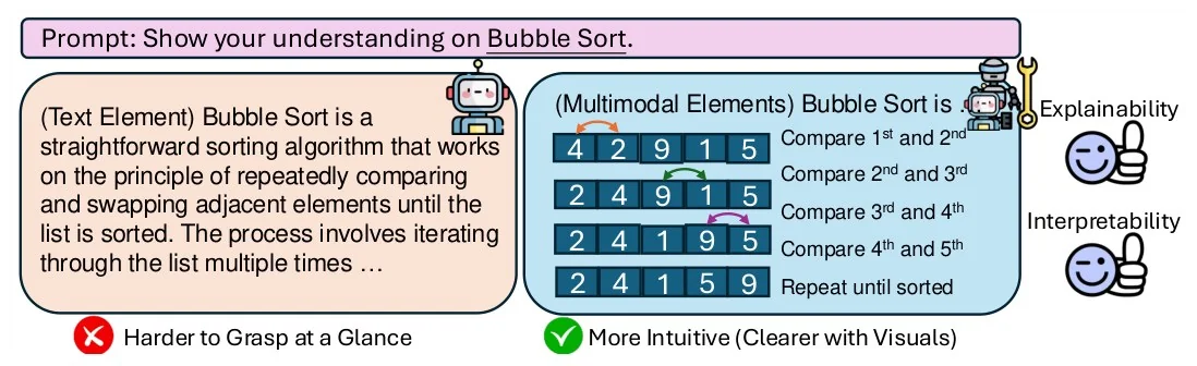
Figure 1 of "TheoremExplainAgent: Towards Video-based Multimodal Explanations for LLM Theorem Understanding", Ku et al., ACL 2025. Paper. CC BY 4.0; cropped and resized.
What to borrow:
- One shared input bar across the top (the prompt), so both panels visibly answer the same question.
- Two panels of identical size and shape. The only things that differ are fill colour and content, which makes the comparison fair at a glance.
- The verdict is written under each panel in five words, with a cross and a tick. A reader who looks for two seconds still leaves with the claim.
- The example is deliberately trivial (bubble sort). The figure sells the idea, not the difficulty.
Wide two-panel comparison figure. A full-width input bar on top.
Left panel: the existing approach, muted colour, ends in a short
negative verdict with a cross. Right panel: our approach, same size,
accent colour, ends in a short positive verdict with a tick.
Same toy example in both panels. Flat vector style, white background.
2. The Layered Framework (framework)
Use it for systems with several cooperating parts, especially agents, where the reader needs to see both the structure being built and the machinery that builds it.
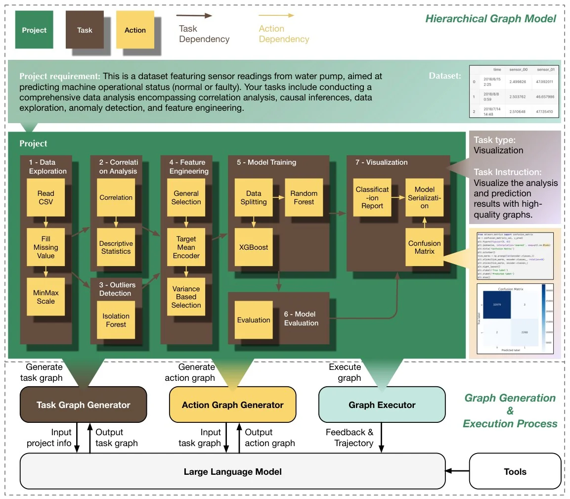
Figure 1 of "Data Interpreter: An LLM Agent for Data Science", Hong et al., Findings of ACL 2025. Paper. CC BY 4.0; cropped and resized.
What to borrow:
- The legend comes first, top left, as three colour swatches: project, task, action. After that, colour alone carries the hierarchy and no box needs a type label.
- Nesting does the work that arrows usually do. Action nodes sit inside task nodes, which sit inside the project panel.
- One task is pulled out to the right and enlarged. The overview stays clean while one instance shows the real detail.
- Foundations go at the bottom: the LLM and the tools are flat, full-width bars. Things everything else stands on are drawn as floors.
Wide system overview figure. Top-left legend with three colour swatches
for three node types. Centre: a large panel containing a nested graph,
small nodes inside medium group boxes. Right: one group enlarged as a
zoom-in callout. Bottom: three module boxes standing on two full-width
base bars. Flat vector style, restrained palette, white background.
3. The Pipeline with Zoom-Ins (pipeline)
Use it when the method is a sequence of stages and each stage has internals worth showing. It is also the layout that overcrowds most easily, because every stage wants to show everything.
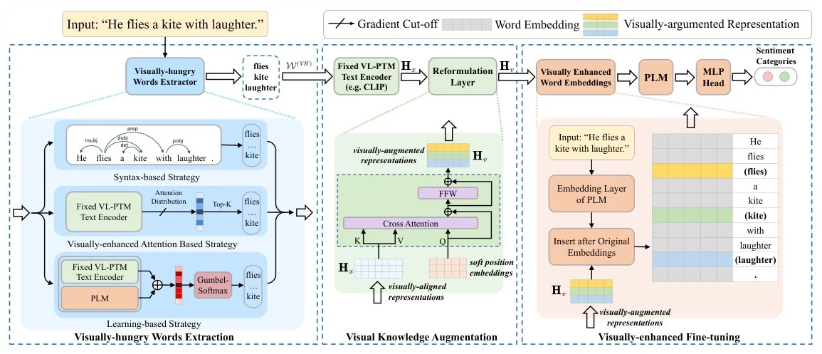
Figure 1 of "Visually-augmented pretrained language models for NLP tasks without images", Guo et al., ACL 2023. Paper. CC BY 4.0; cropped and resized.
What to borrow:
- Two reading levels. The top strip is the whole method in one line, input sentence to prediction. The three panels below are for the reader who wants to go deeper.
- Each stage owns one background tint, and the tint of the module in the top strip matches the panel that explains it. Colour is the index.
- Stage names sit at the bottom of each panel in bold, like captions, so they never compete with module labels.
- The same toy sentence travels through every stage. The reader tracks one example instead of decoding notation.
Wide pipeline figure with two levels. Top: a thin left-to-right strip of
about seven modules joined by arrows, from an input sentence to an output.
Below: three dashed panels side by side, each zooming into one stage,
each with its own pale background tint matching its module above, bold
stage name at the bottom of each panel. One running example throughout.
4. The Colour-Coded Architecture (architecture)
Use it when the contribution lives inside the model: which blocks exist, which are trained, which are shared.
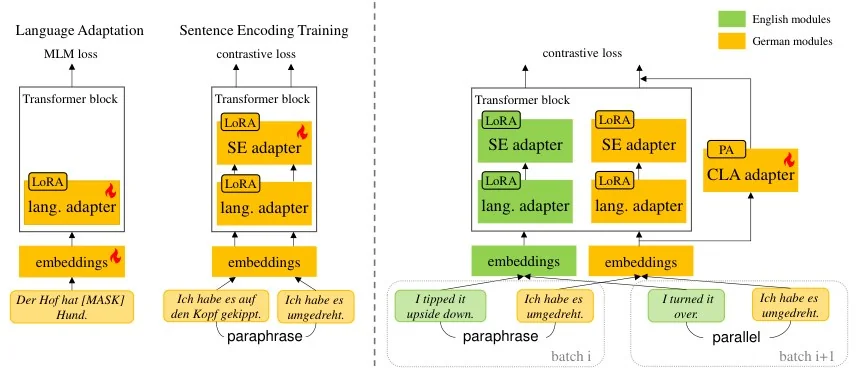
Figure 1 of "Modular Sentence Encoders: Separating Language Specialization from Cross-Lingual Alignment", Huang et al., ACL 2025. Paper. CC BY 4.0; cropped and resized.
What to borrow:
- Two colours, two meanings: green is English, yellow is German. Nothing else in the figure is coloured, so the mapping is learned instantly.
- A small flame marks what is being trained. Trainable versus frozen is the question every reader of an architecture figure asks, and here it is answered without a word.
- Bottom-to-top data flow, inputs as real sentences in italics. Real inputs make abstract blocks concrete.
- A dashed vertical line separates the training stages from the final setup. Whitespace and one rule, not a border around everything.
Wide model architecture figure, data flowing bottom to top. Rounded
blocks stacked inside outlined transformer containers. Exactly two
accent colours, each standing for one data source, defined in a small
top-right legend. A small flame icon on trainable blocks. Example input
sentences in italics along the bottom. A dashed vertical line separating
training stages on the left from the final configuration on the right.
5. The Decision-Tree Taxonomy (taxonomy)
Use it for surveys, empirical studies and benchmarks, where the contribution is the map itself.
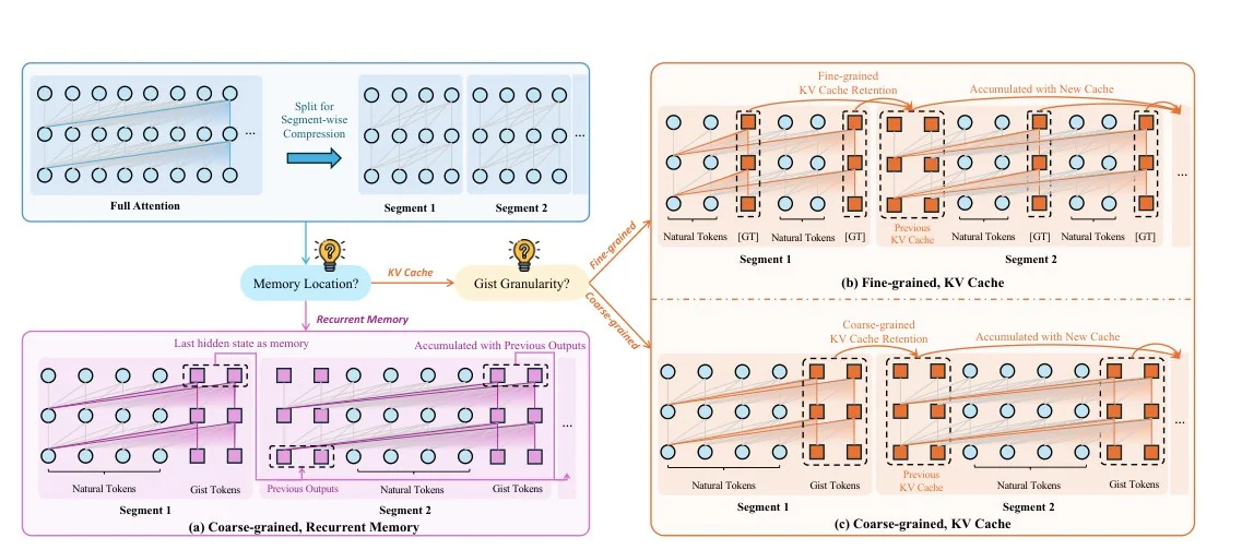
Figure 1 of "A Silver Bullet or a Compromise for Full Attention? A Comprehensive Study of Gist Token-based Context Compression", Deng et al., ACL 2025. Paper. CC BY 4.0; cropped and resized.
What to borrow:
- The taxonomy is drawn as the questions that generate it ("Memory location?", "Gist granularity?"), not as a list of names. The reader learns why there are three families, not just that there are.
- Each leaf is a full panel drawn with the same visual grammar (same token circles, same segments), so differences between families are the only thing that changes.
- Branch colour is inherited: the purple branch leads to the purple panel, the orange branch to the orange ones.
- The baseline sits apart, top left, in a neutral blue. It is the reference point, not a competitor.
Wide taxonomy figure. Top-left: a neutral baseline panel. Centre: two
small rounded decision nodes phrased as questions, with labelled branches.
Each branch leads to a large panel showing one method family, all panels
drawn with identical visual elements so only the differences stand out.
Panel colour matches its branch colour.
6. The Worked Example (teaser)
Use it when the task itself is new and a reader needs to see one instance of it from start to finish before any method makes sense.
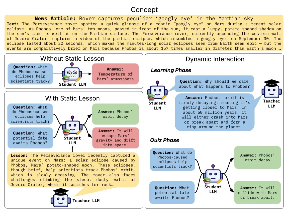
Figure 1 of "INTERACT: Enabling Interactive, Question-Driven Learning in Large Language Models", Kendapadi et al., ACL 2025. Paper. CC BY 4.0; cropped and resized.
What to borrow:
- Four colours with fixed roles: yellow for source text, blue for questions, green for right answers, red for wrong ones. You can read the outcome of every panel without reading a sentence.
- The baseline conditions are stacked on the left; the proposed setting gets the entire right half. Area is emphasis.
- Two recurring characters (a student and a teacher) replace what would otherwise be a paragraph of role definitions.
- It is taller than most Figure 1s, and it needs to be: dialogue takes vertical room. Break the wide-banner rule when the content is a conversation.
Worked-example figure. Full-width source text box on top in pale yellow.
Left column: two stacked baseline panels. Right column, twice as wide:
the proposed setting in two phases. Speech-bubble boxes colour-coded by
role: blue questions, green correct answers, red wrong answers. Two small
recurring robot characters, one with a graduation cap.
Picking One
| If your paper's one-sentence story is… | Start from |
|---|---|
| "The old way fails here; ours does not" | Before/after split |
| "Several components cooperate to do X" | Layered framework |
| "Input goes through stages A, B, C" | Pipeline with zoom-ins |
| "We change this part of the model" | Colour-coded architecture |
| "Here is how this space is organised" | Decision-tree taxonomy |
| "Here is a new task; watch one instance" | Worked example |
Then three checks that apply to all six. Compose at roughly 21:9 unless your content is a dialogue. Give every colour exactly one meaning and put that meaning in a legend or make it obvious. Shrink the figure to the width of a two-column page and delete or enlarge any label you cannot read.
Borrow the Skeleton, Not the Artwork
Everything above is about hierarchy, spacing and reading order, which nobody owns. The drawings themselves belong to their authors. The six figures in this post are reproduced under the CC BY 4.0 licence that the ACL Anthology applies to material published since 2016, with credit and a link under each one. If you want to reuse a figure from another venue, check that paper's licence first; a figure appearing in a gallery does not make it free to reuse.
For more examples of each layout, the Top-Conf Figure Gallery lets you filter all 2,298 figures by venue, year and pattern. We also wrote a separate guide to the Top-Conf Figure Gallery and what its data shows.
Where PaperBanana Fits
Once you know which skeleton you want, the remaining work is drawing it. PaperBanana generates publication-ready academic figures from a text description: paste one of the layout prompts above, replace the generic parts with your modules and your running example, and pick the 21:9 aspect ratio. When a co-author wants one label moved, you can convert the result into a fully editable SVG and move it yourself.
Figure Credits
All six figures are © their authors, licensed CC BY 4.0 via the ACL Anthology, cropped from the paper PDF and resized; located through the Top-Conf Figure Gallery.
- Max Ku, Cheuk Hei Chong, Jonathan Leung, Krish Shah, Alvin Yu, Wenhu Chen. TheoremExplainAgent. ACL 2025.
- Sirui Hong, Yizhang Lin, Bang Liu, Bangbang Liu, Binhao Wu, Ceyao Zhang, Danyang Li, Jiaqi Chen, Jiayi Zhang, Jinlin Wang, Li Zhang, Lingyao Zhang, Min Yang, Mingchen Zhuge, Taicheng Guo, Tuo Zhou, Wei Tao, Robert Tang, Xiangtao Lu, Xiawu Zheng, Xinbing Liang, Yaying Fei, Yuheng Cheng, Yongxin Ni, Zhibin Gou, Zongze Xu, Yuyu Luo, Chenglin Wu. Data Interpreter: An LLM Agent for Data Science. Findings of ACL 2025.
- Hangyu Guo, Kun Zhou, Wayne Xin Zhao, Qinyu Zhang, Ji-Rong Wen. Visually-augmented pretrained language models for NLP tasks without images. ACL 2023.
- Yongxin Huang, Kexin Wang, Goran Glavaš, Iryna Gurevych. Modular Sentence Encoders. ACL 2025.
- Chenlong Deng, Zhisong Zhang, Kelong Mao, Shuaiyi Li, Xinting Huang, Dong Yu, Zhicheng Dou. A Silver Bullet or a Compromise for Full Attention? ACL 2025.
- Aum Kendapadi, Kerem Zaman, Rakesh R Menon, Shashank Srivastava. INTERACT. ACL 2025.